Designing a great website involves a lot more than just putting together some text and images. Your website is the online representation of your brand, and it is often the first interaction that users have with your business. Therefore, it is crucial to ensure that your website has an appealing design that is both professional and user-friendly. In this article, we will discuss 20 tips that you can use to make your website look great.
Get a Professional Logo
Your website logo is the first thing that people see. The feeling that your logo evokes may make or break a user’s perception of your website. Therefore, it is crucial to use a professionally made logo on your website that represents your brand effectively.
Don’t Forget to Add a Favicon

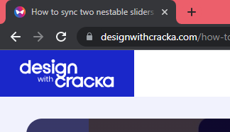
A favicon is a small icon that serves as branding for your website. It helps users locate your page easily when they have multiple tabs open, and it also supports brand awareness and recognizability. You should keep your favicon as simple as possible.
Use Good Quality Images
High-quality images are defined by their sharpness, relevance, and speed. Nobody wants to see a blurry or skewed image on your site. For businesses that rely on their website for consumer interaction, the importance of having sharp, professional photos cannot be overemphasized. To apply best image practices to your website, ensure your images are sharp, and the subjects in the image can be easily identified. Make the file size as small as possible without losing significant image quality. Websites like Shotpixels.com, Tinypng.com, or Burme.net can help you to do this.
Use Consistent Image Tone
Using a consistent image tone is crucial to make your website look clean and professional. You don’t want to have images with different tones, so make sure you give them the same filter if you want your images to be black and white. Make sure your images look like they are coming from the same source.
Have a Good Color Scheme
Your website color scheme is more than just the aesthetics of the website. It aligns with your brand’s image and values and influences how people feel. A good color combination on your website will create a powerful visual impact to your visitors. Use online tools like Colors.co or Color designers.io to create the best color combinations.
Use a Maximum of Three Colors
Use a maximum of three colors for your brand. This doesn’t include the shades of your primary, secondary, and accent colors. In some cases, using just two is enough with the shades. Do not go about using multiple different types of colors except in rare cases where you can be very creative with a multi-colored design.
Use Light Gray Text on Black or Dark Background

Use light gray text on black or dark background instead of pure white text. This makes it easier on the eye and more comfortable to read.
Pay attention to contrast
Contrast is the difference between the foreground (e.g. font) and background element. By using contrasting colors the content of your website can be easily read by everyone. The contrast of your website helps organize your design and establishes a visual hierarchy. A good contrast adds visual appeal to your content.
Choose the right font for your business
A good typography makes potential customer feel at home with your brand, hence the choice of font must be clean and legible as possible to attract attention. Use fonts that are easy to read. For example, it would not be good to use a techie font for a lawyers website.
Use appropriate line-heights, font weight and letter spacings
Even with the right font you will need the right typography configuration to drive home the visual impact of the font on your website. To ensure your font are well spaced out, use at least a line height value of 1.5 for your paragraph text, and a minimum of 1.3 for your headings.
Make Use of White Space
White space, also known as negative space, is the area between design elements. It can give your website a clean and modern look while making it easy to navigate. Use white space to highlight important elements on your website.
Use Clear Navigation
Clear navigation is essential for users to find what they’re looking for on your website quickly. Ensure that your navigation is straightforward and easy to use.
Ensure Fast Page Load Times
Fast page load times are crucial for your website’s success. Slow loading times can cause visitors to leave your site, leading to a high bounce rate.
There are several ways to improve page load times for your website, including:
- Optimize images: Compressing images can significantly reduce the file size, leading to faster loading times.
- Minimize HTTP requests: Reducing the number of HTTP requests can help to improve page load times by reducing the amount of time it takes to download resources.
- Enable browser caching: Caching allows users to store website data on their device, reducing the amount of data that needs to be downloaded on subsequent visits.
- Use a content delivery network (CDN): A CDN can help to improve page load times by delivering website content from a server closest to the user’s location.
- Minimize JavaScript and CSS: Minimizing JavaScript and CSS files can help to reduce the size of files, leading to faster loading times.
- Use a faster hosting provider: Choosing a faster hosting provider can help to improve page load times by reducing server response times.
Use an appropriate font size and style
Choosing the right font is important for the legibility of your website. It’s important to use a font size and style that is easily readable. If your font is too small or too fancy, it can be difficult for users to read. Make sure you choose a font that is appropriate for the content on your website.
Use contrasting colors
The use of contrasting colors can make a big difference in the look and feel of your website. If you use colors that are too similar, it can be difficult for users to distinguish between different elements on your page. Make sure you use contrasting colors to help your users easily navigate your website.
Be consistent with your design
Consistency is key when it comes to web design. Make sure you use the same fonts, colors, and layout throughout your website. This will help users easily recognize your brand and feel comfortable navigating your site.
Optimize your images
Large images can slow down your website, which can be frustrating for users. Make sure you optimize your images by compressing them and reducing their size. This will help your website load faster and improve the user experience.
Test your website
Once your website is complete, it’s important to test it thoroughly. Check for broken links, errors, and inconsistencies. Make sure your website is user-friendly and easy to navigate. This will help ensure that users have a positive experience on your site.
By following these tips, you can create a website that looks professional and is easy to use. Remember to keep your users in mind throughout the design process and make adjustments as needed to improve their experience. Good luck with your web design!


